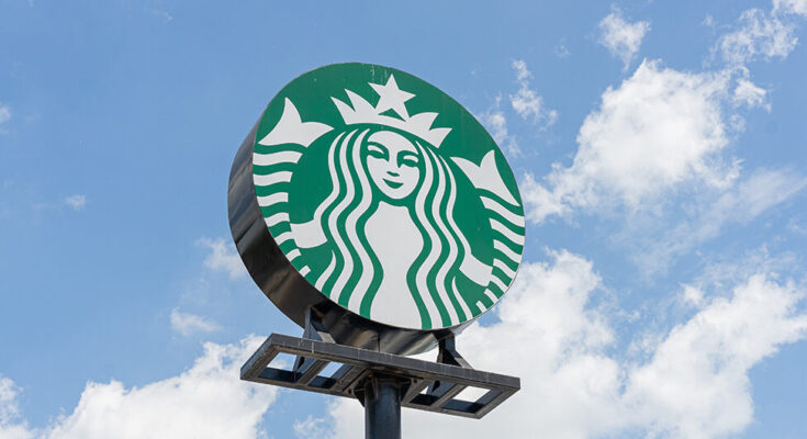
Many of us know the Starbucks’ siren as the green vixen who lures thirsty people into her stores, enchanting coffee lovers with her magical brew and her irresistible aromas.
And though she quickly triggers a coffee craving with her promise of the perfect blend, there’s a few small details that make the two-tailed mermaid delicously imperfect.
In 1971, when Starbucks was just a humble coffee bean retailer in Seattle’s Pike Place Market, the founders were looking for a name and logo that embodied adventure and the seafaring tradition of early coffee traders.
After considering names like Pequod, the whaling ship from “Moby-Dick,” the company settled on Starbucks, inspired by the first mate in Herman Melville’s novel.
This maritime theme led to the selection of a twin-tailed mermaid, or siren, as the logo, symbolizing the allure and mystery of the sea.
“It’s the siren. She is not a real person, but we kind of think of her as one. She’s the biggest symbol of our brand…She’s the face of it,” says Steve Murray, a creative director in the Starbucks Global Creative Studio. “The siren is like a super mermaid. A mermaid with one tail is just a plain ol’ mermaid. (Sorry Ariel).”
Her first facelift
The original logo featured a brown, monochrome image of the bare-breasted siren, reflecting the earthy tones of coffee. However, in 1987, as Starbucks expanded, the logo had a makeover, and the creepy creature became less creepy.
The color shifted to a vibrant green, symbolizing growth, freshness, and the brand’s commitment to quality. Additionally, the siren’s hair was adjusted to cover her breasts, making the image more modest and aligning with evolving societal norms.
Another makeover
By 1992, Starbucks had become a household name, prompting another logo update. This time, the focus was on the siren’s face, cropping out her body to create a more intimate and recognizable image. Only the tips of her tails, still held in her two hands, were visible.
She speaks for herself
In 2011, to celebrate its 40th anniversary, Starbucks unveiled a bold new logo. The company name was removed, leaving only the siren to represent the brand.
“I hope when people see the siren on their cup, of course it’s going to stand for what they’re going to get from Starbucks,” Murray said of the globally recognized logo “If the siren is on that cup of coffee, it’s going to be awesome.”
Making her more ‘human’
This minimalist approach signified Starbucks’ evolution beyond just coffee, embracing a broader range of products and experiences. The siren’s face was further refined, making her appear more human and relatable.
Speaking of the siren’s face, there’s a fascinating detail that many might miss. While the logo’s design aims for symmetry, a slight asymmetry was intentionally introduced to make the siren appear more human and less like a “perfectly cut mask.”
She couldn’t be “perfect, like Barbie,” and needed a subtle imperfection to add character and warmth to the logo, making her more inviting to customers.
Global creative director Connie Birdsall tells Fast Company that the design team had “to step back and put some” “humanity back” in the siren’s face. “The imperfection was important to making her really successful as a mark,” she said.
“In the end, just for the face part of the drawing, there’s a slight asymmetry to it. It has a bit more shadow on the right side of the face,” says design partner Bogdan Geana. “It felt a bit more human and felt less like a perfectly cut mask.”
The siren today
The siren you see today is asymmetrical but you have to look very closely to spot the imperfections. There’s extra shadowing on the right side – her right eyebrow looks longer – and her nose dips lower, also on the right.
Can you see it now that you know?
The Starbucks’ logo is more than just a green circle with a siren; it’s a symbol of the brand’s journey, values, and connection with its customers. Next time you sip your favorite brew, take a moment to appreciate the rich history and hidden stories behind that iconic two-tailed mermaid.


